I produced this data sonification illustrating an average day and week of screentime for a member of Gen Z. Through sound cues like vibrations and pickups, it blends personal reflection with statistical insights, quantifying the impact of daily phone use.
Digital Natives or Digital Captives? How This (Scary) Data Sonification Got Made
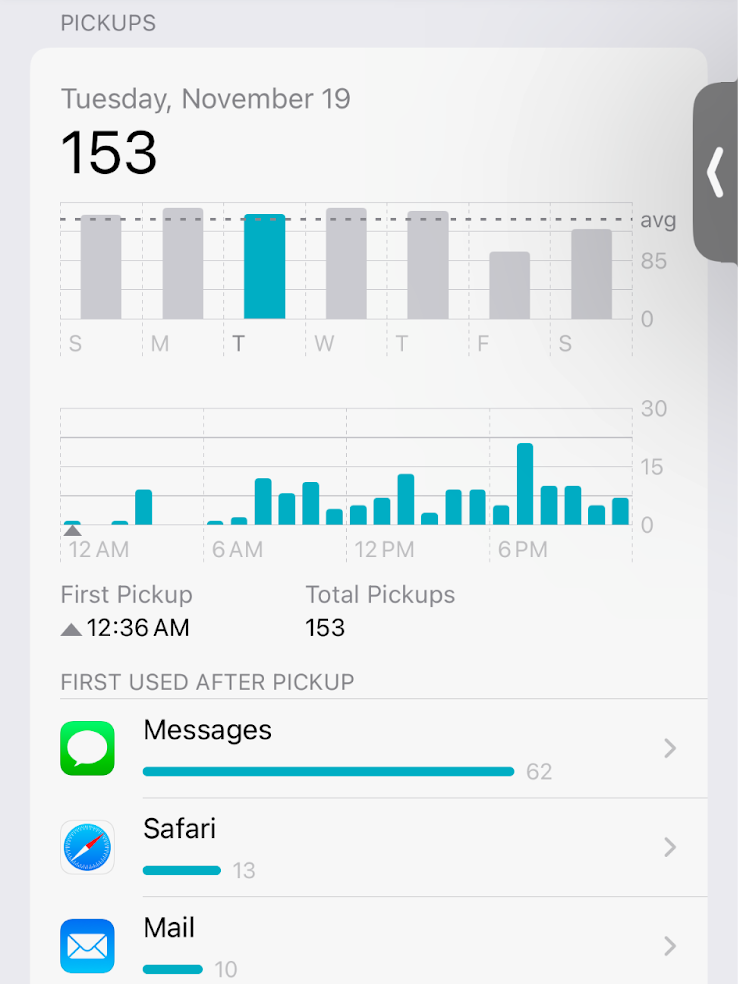
Through Settings → Screen Time → See All App & Website Activity, any iPhone user can access their screentime data. You can view the number of hours per day over the course of a week, and clicking a day of the week’s bar breaks the day further down by hour. You can also view the total number of pickups per day. This is mine:
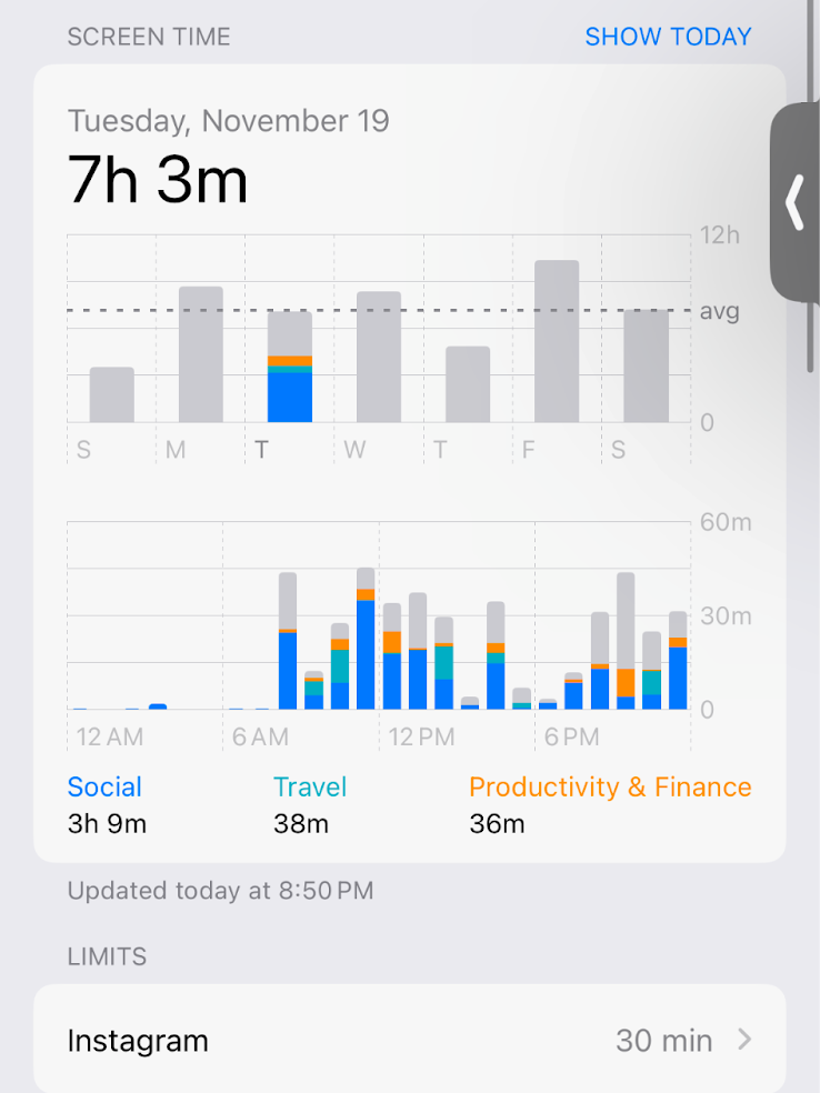
Apple making this data accessible made me curious to follow my own screentime over the past few months. Through this and conversations with other Gen Zers, it became quickly apparent that spending less than 7 hours/a day was hard. It took intentional effort. Seven hours is a long time, and yet we speak about these numbers so casually. Someone saying they have 4 hours/a day is met with, “Oh, that’s not bad at all!” I became interested in understanding how much of your day 7 hours really is.
While my quantifiable question was how much time Gen Z spends on their phone on average, I wanted to use a medium that could answer the question of how this time feels over the course of a full 24-hour period. I chose to create a data sonification which explores Gen Z’s screentime habits by turning the raw numbers into an auditory experience—one that offers listeners a way to truly feel the staggering amount of time my generation spends on screens.
I wanted to sonify the day of an average member of Gen Z in a way that would capture both the hours spent and the number of pickups. I found dcdx, a Gen Z-specific research lab. Since 2021, they have been releasing annual reports on screentime, which they’ve developed by surveying hundreds of Gen Zers through their Apple-provided metrics, as shown above. Here is one of their reports, for example.
The issue was that they don’t make the average number of minutes, broken down by hour, available. For example, they have that Gen Z spends 7 hours and 23 minutes on their phones per day in 2024, but not how many minutes the composite/average Gen Zer spends at 2am, 6pm, etc. I reached out to dcdx’s founder for the most “raw” data they have, and he confirmed that they don’t have it broken down more than in the report.
Data Set Creation
In order to capture the progression of the hours over the course of a day, I would need to use my own data. Since I averaged a daily 7 hours and 8 minutes the last week of November, I was very much in line with the Gen Z average. I spent 7 hours and 3 minutes on Tuesday, so I chose to use the hour-by-hour data from that day:

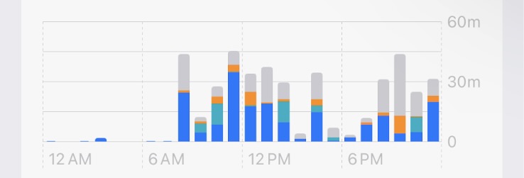
I needed to extract the number of minutes per hour in an accurate way, as Apple only provides the bars. I used the Plot Digitizer web tool to convert the bar graph for the number of minutes spent per hour into a .csv file.
I also did the same for the graph of the number of pickups by hour. “Plot-digitizing” the pickups looked like this:
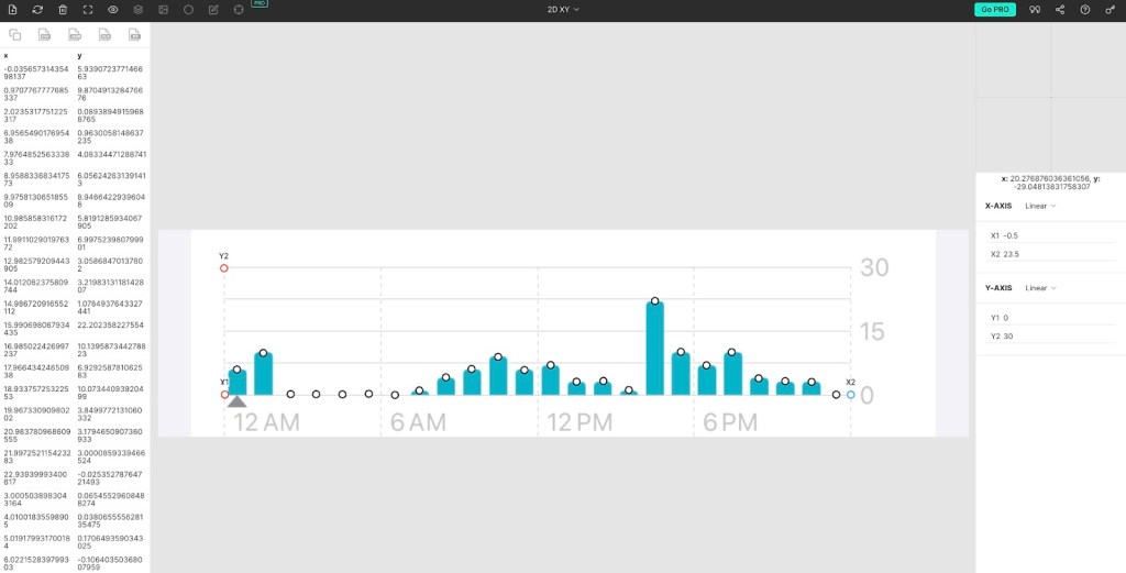
Axes and coordinates are manually selected by dropping dots along the bar graph. Data points are then generated into a .csv, as shown on the left.
Data Wrangling
Part 1: Sonification of a day.
The raw data from the plot digitizer contains estimates of the bar graph with meaningless trailing digits. In Excel, I added extra columns to round the plot estimates into whole minutes and whole pickups for each hour. In order to get the data in a place so that I could sonify each minute, I wrote a Python script to expand each hour into 60 rows, one representing each minute. I added an extra column containing ones and zeroes, with ones representing minutes I was on my phone (1=YES, on phone) and zeroes representing minutes I was not on my phone (0 = NO, not on phone).
I then put this into TwoTone to generate the vibration noise that represents when I was on my phone. Since every second of vibration represented a minute I was on my phone, TwoTone generated a 1140-second, or 19-minute, clip to represent the 24-hour day. Obviously, way too long. So in Final Cut Pro, I condensed the clip to be less than a minute, making every 2 seconds represent 1 hour. I said all this in the parameters I explain in my narration: 2 seconds = 1 hour of screentime. Vibration = time on phone. Silence = time off phone. I also included verbal tick marks to scaffold the day. Every three hours, I said the hour: Midnight, 3am, 6am…6pm, 9pm, midnight. I manually inserted the correct number pops, each representing a pickup, into each scaffolded hour.
Part 2: Sonification of a week.
I also wanted to capture what a full week of screentime feels like.
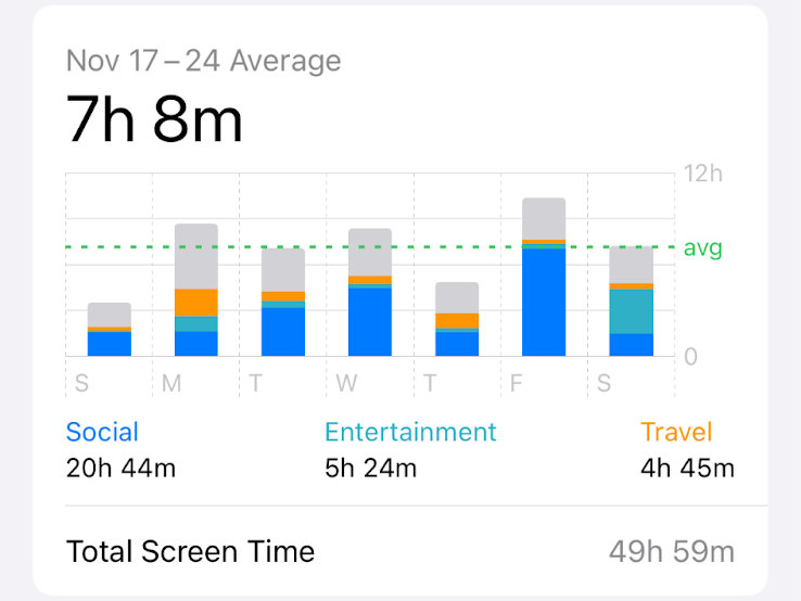
I created a new Excel spreadsheet. With rows representing days of the week, I entered the total screentime/per day and “Social” screentime values. As you can see in the above image, Apple does provide the total time spent on social-categorized apps.
I created new columns to calculate the following values: (1) the percent of a 16-hour day spent on the phone, (2) the percent specifically spent on social apps, and (3) the percent of the day not spent on the phone. I chose it to be out of 16 hours, since that’s a full day of being awake; I made this clear in my narration.
Since each day would be represented by a 5-second interval, I again added new columns to calculate the amount of seconds needed for the brown noise [time off-screen], vibration [time on-screen], and Wii Theme Song segment [time on a social app specifically]. I could now easily edit the sounds that make up the week by knowing how many seconds each one should be. I overlaid each “time on a social app” segment over each “time on-screen” segment. Once again, I provided verbal tick-marks: Sunday, Monday…Friday, Saturday.

