View this data visualization story on flourish: https://public.flourish.studio/story/2687145/
On the last page, interact with the graphic by selecting and deselecting factors.
I became interested in the role that victims’ race play in Texas execution cases after reading this article by the Death Penalty Information Center, “As the Lone Star State Conducts 400th White-Victim Execution, Study Shows Black Lives Matter Less in Texas Capital Cases.” The study’s analysis shows an incredibly low percentage of white perpetrators who were executed for crimes against Black victims. “In every single comparison, the racial disparity was statistically significant,” Jelani Jefferson Exum and Dr. David Niven, study authors, write. “In every single comparison, harsher punishment was associated with white victims than with African American victims, who clearly mattered less.”
This made me wonder about the relationship between the race of victims in these cases and the race of the perpetrator. It is apparent from the article that most cases in Texas which have resulted in execution have only white victims. What’s not so clear is how the role of the victim’s race may change when the perpetrator’s race is accounted for. If the disparity between Black victims and white victims in these cases changes starkly when the perpetrator’s race is factored in, that could add an extra layer to how race influences cases deemed deserving of the death penalty. I wanted to expand the scope of this analysis to white and non-white perpetrators/victims to examine the role of “whiteness” more broadly.
So, my question became: Could the disparity between white and non-white victims in execution cases change when accounting for the race of the case’s perpetrator?
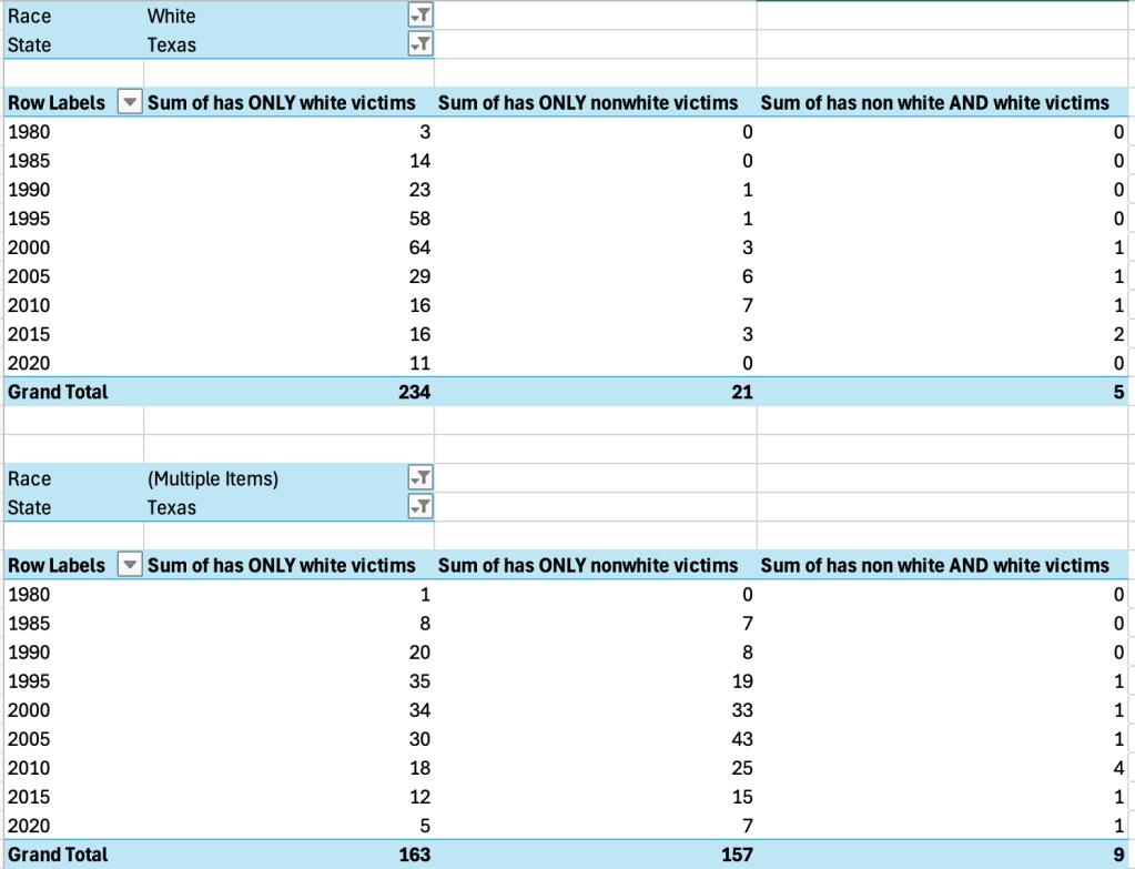
In order to tackle my question, I needed to make a visualization that hones in on Texas with four key groups: white perpetrators with white victims, white with non-white victims; non-white perpetrators with white victims, non-white with non-white victims.
The data came with perpetrators’ victim count separated by race and gender; so for example, “Number of Latino/a Male Victims, “Number of Latino/a Female Victims.” I created new columns like “has Latino/a victims,” “has Black victims,” “has Asian victims,” etc. I could then create a column that determined whether the perpetrator has any non-white victims, with 1 being yes and 0 being no (so at least one victim in any of the victim demographic categories except white). But then a new edge case emerged: what if they had both white and non-white victims? I created a new column, “has non-white and white victims,” with a formula that was an and statement within an if statement — for example, “=IF(AND(AH2>0,AM2>0),1,0).” I could then make two new columns, “has ONLY white victims” and “has ONLY nonwhite victims” by simple subtraction.
Before entering the data into Flourish, I made two Pivot tables; both filter out just Texas executions, but one filters only white perpetrators and one filters only non-white perpetrators:
In assessing the data quality, I realized that some years were missing (when there were no executions). I accounted for this by creating “year bins” in five-year ranges through the Excel function MOD() which spits out the remainder after dividing by 5, and then subtracts this number from the original year. So, 1981, for example, becomes 1980. I changed this label to “‘80-’84” for clarity, as this is what 1980 represents. 2018, for example, became 2015, or the ‘15-’19 bin. This also had the added (important!) benefit of reducing noise within the graphic itself.
In Flourish, I played around with a number of charts before settling on a column chart with stacked percentages. It became evident this was the best way to depict the data after discovering there was no other way to have all four perpetrator-victim race-combinations displayed at once and remain easily readable; my first instinct was to make an area chart of stacked percentages, but it ended up confusing.
In my chart, the stacked nature of each bar shows the four categories clearly, and I carefully chose colors that aid in naturally spotting differences/overlaps between categories. For example, the light colors were intentionally chosen for cases with white victims. It was important that the graphic be easy to interact with; readers can manipulate the combinations of perpetrator-victim race. Thus, they can see how also accounting for perpetrator race makes white and non-white victim disparities even greater in execution cases. Also, the columns separated by year show how consistent these relationships between perpetrator-victim races remain over time, even as total execution numbers rise and fall again.
I also decided to include two visualizations that clearly illustrate the phenomenon the original article is expressing: Most executions result from cases with white victims. I made one for Texas cases during 1980-2024, and one for all U.S. cases. All the data-wrangling I had done for the main chart (the last, interactive one) was useful for these. I decided not to include the aforementioned edge case—perpetrators with both white and non-white victims—in the interactive graphic, as it was too much noise. But already having this category on Excel meant I could easily adjust the Pivot table filters and import the data into pictograms, including these cases. Overall, I found this a challenge in both data-scraping and discovering the best way to depict interconnected, but different, facets of a story.


Leave a comment